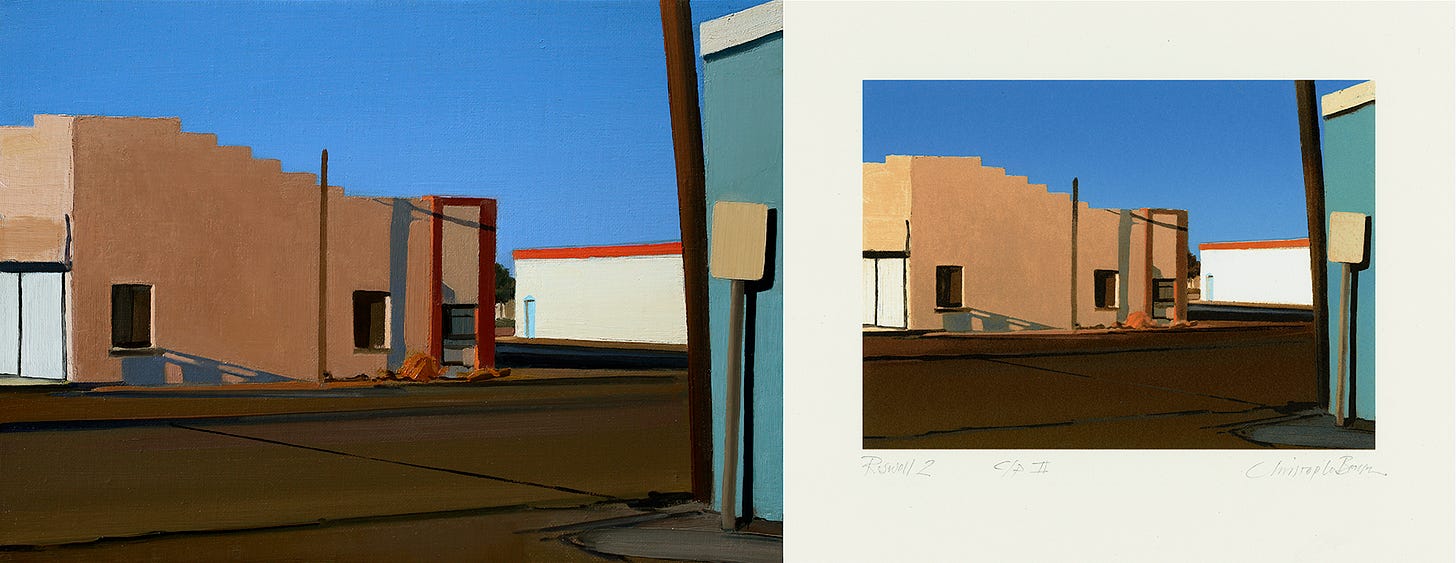
Regular readers of this column will know that while I write in the first person, often including personal anecdotes in my essays on art-related topics, I don’t typically write about my own work. That’s somebody else’s job. However, one project I’ve worked on recently has been such a collaboration — and my partner in it (who is truthfully its primary author) such an exceptional artist himself — that it not only feels legitimate to write about what he has done with my paintings, but also to praise his work.
But first, some history of this imagery:
Throughout my long career as a painter, I’ve explored many subjects and styles — from portraits to landscapes, seascapes, and even abstractions. My longest-running series, however, has been a line of architectural scenes that I began in my teens, then continued as I gradually moved back and forth from one coast of the United States to the other over the next forty-five years. The earliest of these pictures were made in Rhode Island, where I grew up and went to art school, and later also in Brooklyn, New York, where I lived for a few years after college. I went on to paint similar things in England, New Mexico, California and again in Rhode Island until I finally moved permanently to New Mexico with my family in 2006.
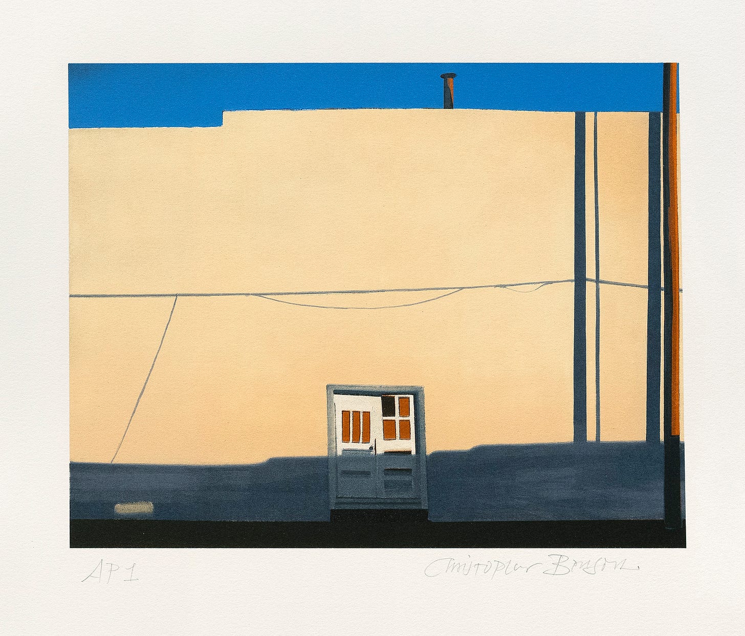
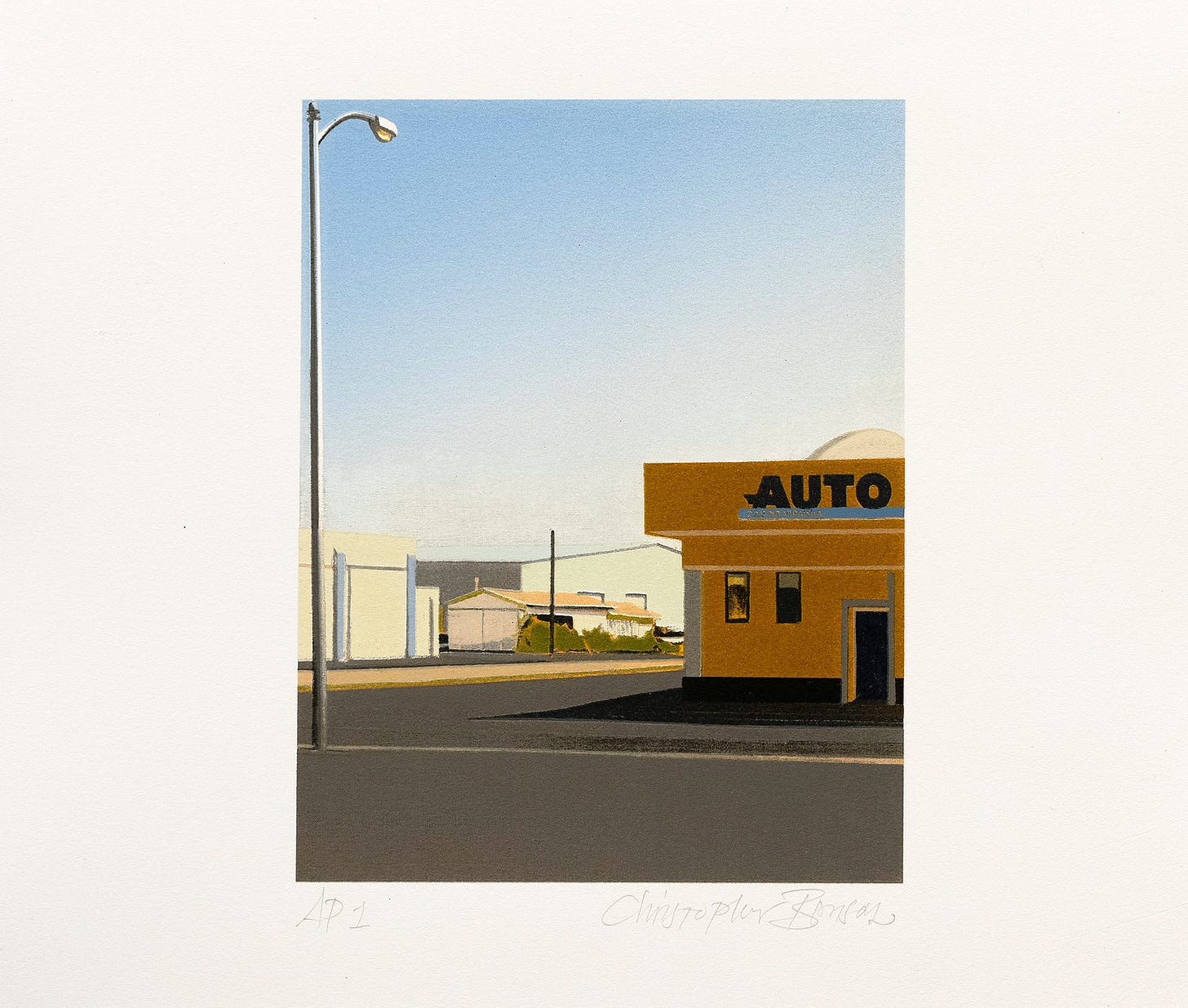
The apotheosis of this line came at last in a group of streetscapes painted in the southeastern New Mexico city of Roswell between 2011 and 2016. These were my last pictures of that kind and, for me at least, its most satisfactorily distilled examples. Much of what made them so was owing to the place itself — to the flatness of its landscape, the angular linearity and formalism of its buildings, and the starkly saturated, reflected sunlight of that southern region of New Mexico. Once I had made them, the long trajectory of that genre finally felt complete. But in 2019, just as I was abandoning this hard, linear architectural realism for more expressive and painterly land and seascapes — and even some abstractions — a printmaker friend broached the idea of making an edition of colored etchings from the Roswell paintings.
Mitchell Marti, a fellow RISD graduate who went through its printmaking program fourteen years after I had first studied both painting and printmaking there myself, is a master printer of exceptional skill and precision. He makes his own art, as well as printing editions for a growing clientele of artists from all over the U.S., and in a variety of printed mediums, at his Interbang Press on the outskirts of Santa Fe.
Mitch and I began work on the Roswell series in 2019, envisioning it at first as a series of etched line and aquatinted color prints. This would involve a complex series of preparatory steps on which we would collaborate before he would commence the main work of running the editions. My part in the project was to re-draw the outlines of each of the pictures we selected with a steel stylus on copper plates prepared with an acid-resistant ground. These plates would then be bathed in an acid solution to etch the lines more deeply into the surface.
The next step was to block-in the colors with more of the resist. The drawn lines would create the architecture of the compositions while the resists isolated areas to be etched as aquatinted fields of color.
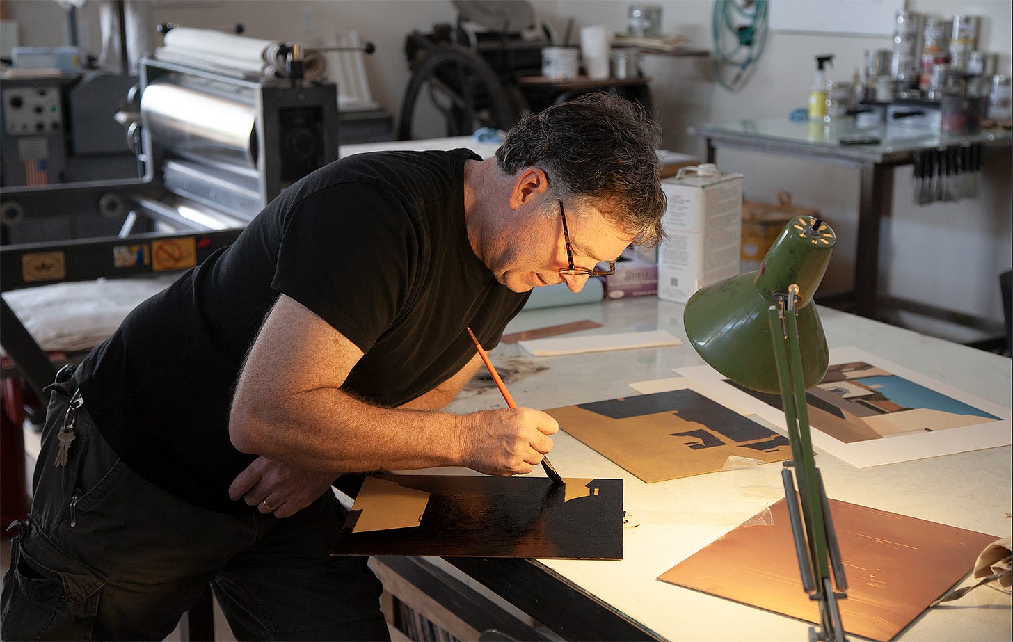
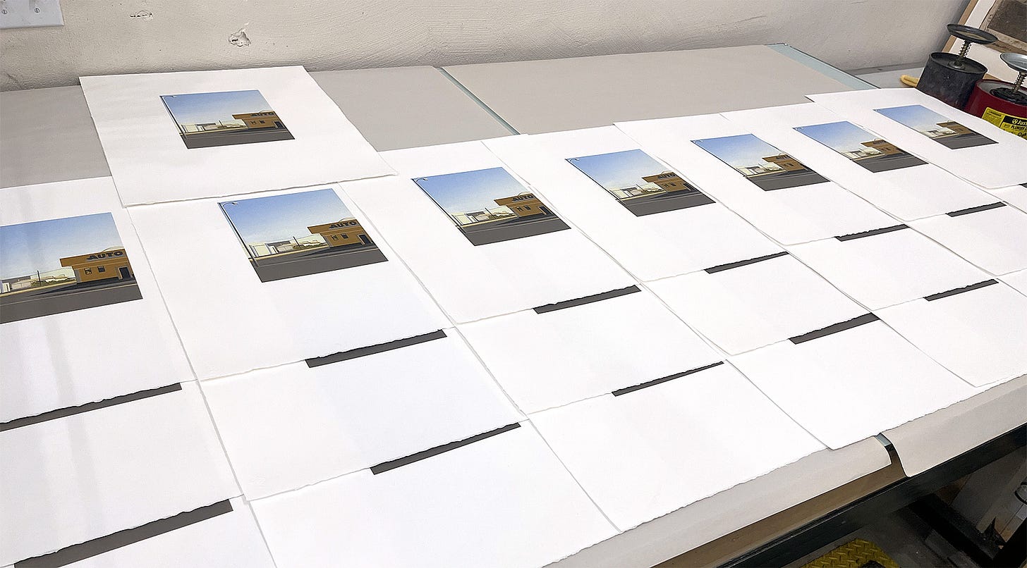
The final images would be assembled in multiple impressions using a different plate for each color in each subsequent pass through the press.
Etching and Aquatint are both Intaglio processes, in which an engraved or etched mark sits below the surface of a metal plate, into which ink is rubbed, with the surface then polished clean. A dampened sheet of paper is placed on top and run through the press under immense pressure, forcing it into the inked lines or tones etched into the plate. This method creates marks that actually sit very slightly above the paper in relief, giving the resulting prints a subtle feeling of depth. Etchings are typically made with hand-drawn lines, where aquatint is a field of tone created with an acid-resistant coating incorporating a microscopic network of cracks rather like the surface of a dried river bed. Once it is printed, this pattern of crisscrossing cracks resolves to the naked eye as a continuous tone, similar to a wash of ink or watercolor.
Mitch’s first etched experiments with the Roswell pictures were promising, but it soon became clear that the labor involved was so onerous that we would both be old men before the edition was complete. At that point we took a different tack and decided to run it as colored lithographs made from direct scans of my original paintings.
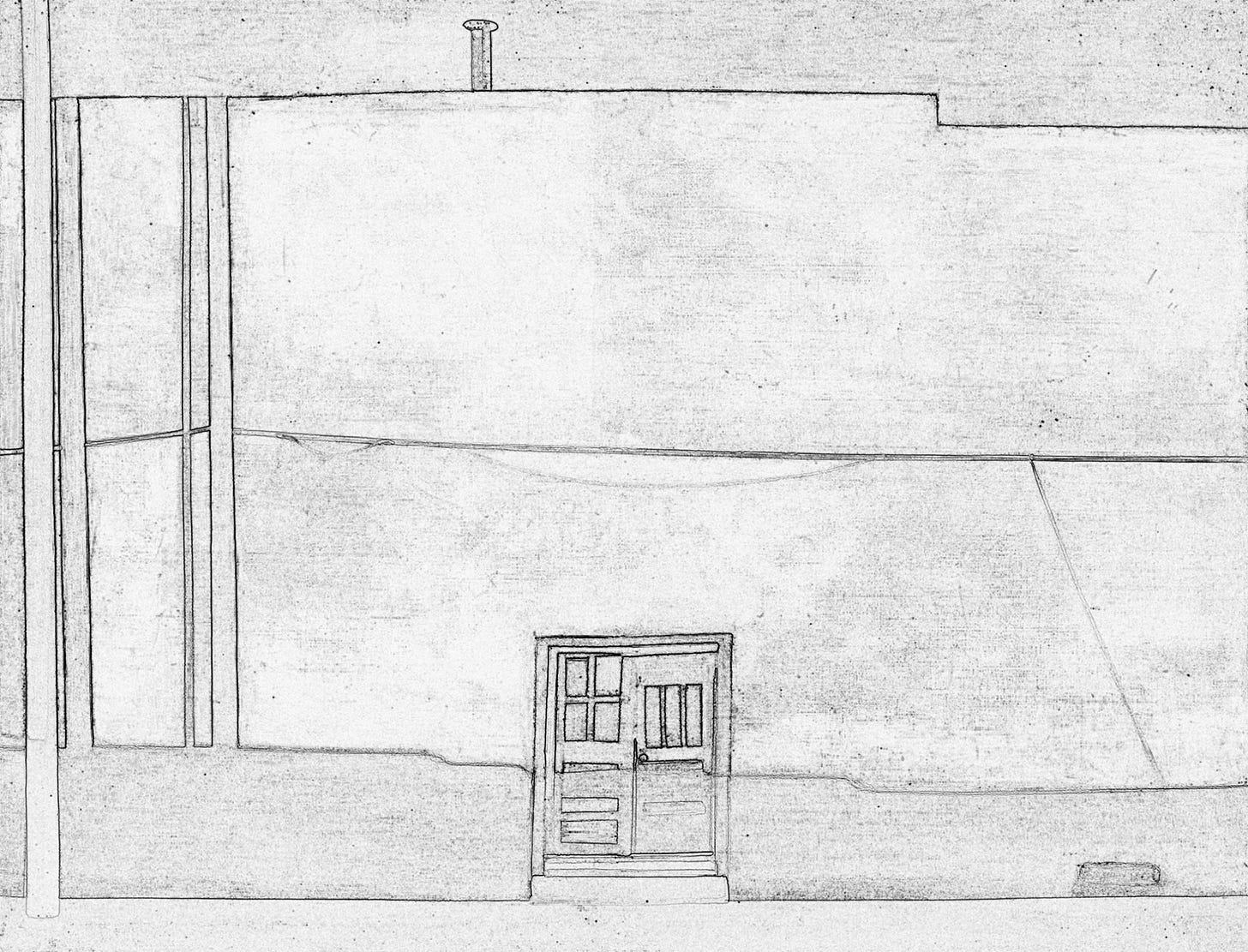
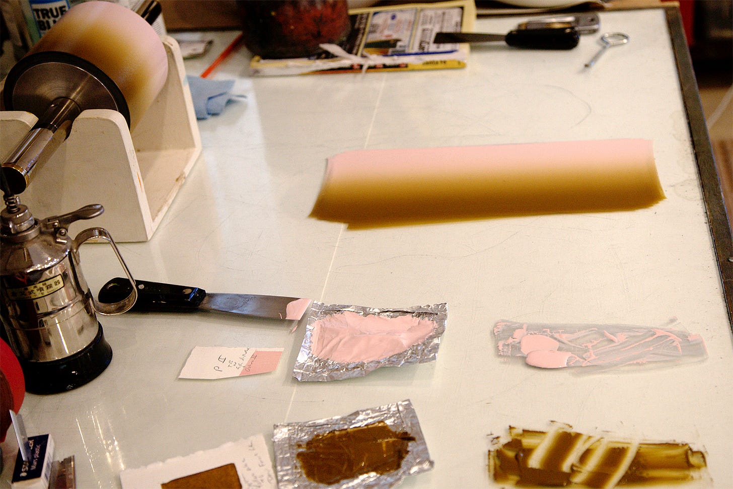
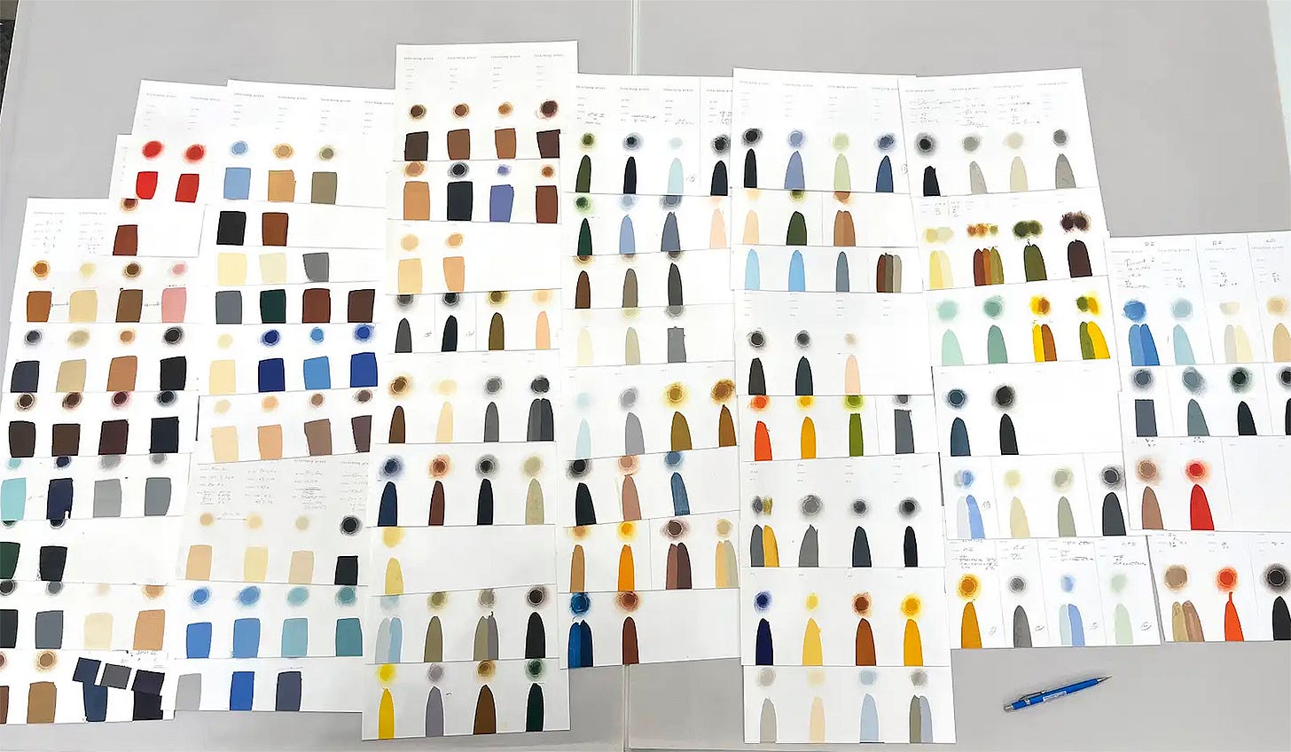
Etching is an ancient and relatively familiar art form to many, but this is less true for lithography, whose originally handmade varieties are overshadowed nowadays by its more pervasive industrial and photographic cousins. Until fairly recently, almost all of the printed matter we would see in our everyday lives — from cereal boxes to magazines, books and posters — was made with a mass-produced, photographically derived form of lithography called photo offset. This sort of printing is done on massive, automated presses in big industrial plants. But the earliest forms of lithography were entirely handmade in small multiple-pass editions much like the etching processes described above. The main difference is that where etchings are printed from marks inscribed into the plate’s surface, lithographs are drawn with water-resistant media on a stone or plate, the surface of which is then dampened with water and inked with oil-based colors that stick to the greasy drawing but avoid the wet spots. Much as would have been true in the etched edition that Mitch originally planned, he still had to mix his inks by hand and eye for the lithos and we worked together to laboriously paint the printing matrix for each color on several different plates for each picture. The only difference which saved us some labor at the front end was that rather than having me re-draw each of my own paintings onto the plates, I instead created photographic scans of the original pictures, which we then converted to outline layouts that were transferred to each plate as a guide for locating the colors.
This is a long-winded way of saying that Mitchell essentially had to re-paint each of my original works by hand in every print. The outlines he used were drawn by me in the originals, but from there on it was all his own eye and hand, and his formidable skills as a printer, that created each printed image in the edition. He had to match and mix each of the colors he used to approximate the appearance of the oil-painted originals in a completely different medium that would somehow still honor the character of the original while taking full advantage of the new medium’s intrinsic attributes and nature. In other words, he had to create a new version of each of my paintings on canvas, but using ink on paper, in such a way that the print carried as much authority in its own right as the originating work.
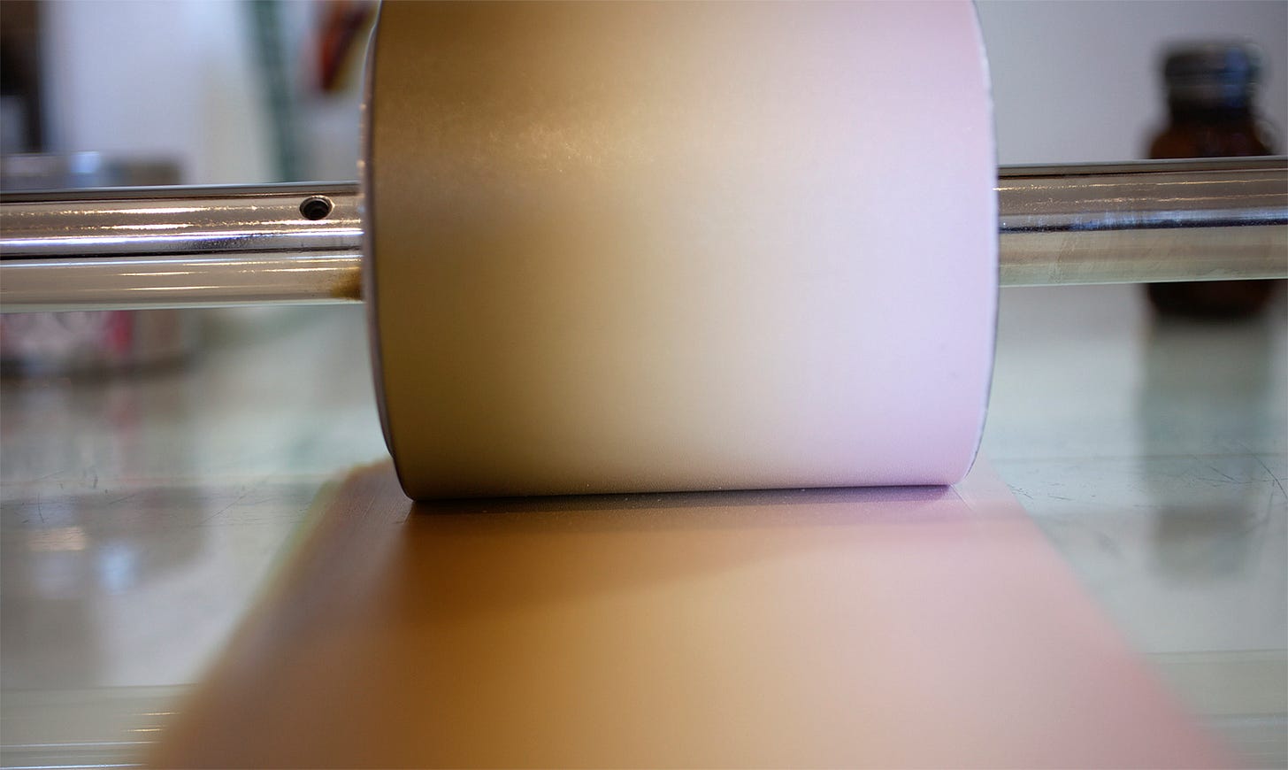
This is no mean feat! Each of these prints not only incorporates multiple different plates, each addressing a specific area of the image — which then have to be printed in multiple registered passes of a single sheet through the press — but each plate also incorporates multiple colors, carefully mixed by hand in a “split fountain” of ink in order to achieve the subtle gradations of tone and luminosity for each color.
The photographer Alfred Stieglitz and the painter Georgia O’Keeffe had a term they often used for artistically recreating the quality that exists in one thing, in an equally meaningful way in some entirely different medium. They called this Equivalence. This is very much what Mitchell Marti does with the editions he prints for other artists like myself. Each of the printed lithographs he has made from my Roswell paintings is, in a very real sense, a new and equally complex, equally artful original work made by his own hand. Mitch’s prints are in this sense equal in their quality and meaningfulness — and in his own very high and handmade form of art — to the objects made by me and from which they are derived.
SOUTH of FORTY, WEST of THE PECOS Nine lithographs of Southeastern New Mexico by CHRISTOPHER W. BENSON
Printed at Interbang Press in an edition of 12 portfolio sets with 2 artist’s proofs and 2 printer’s proofs, and with ten additional sets to be distributed as individual prints.
Color plates by Christopher W. Benson and Mitchell Marti. Color printed by hand from multiple aluminum plates on a Takach Lithography press by Mitchell Marti.
Text sheets set in Hoefler & Co.’s Requiem and printed from polymer plates on a Vandercook proofing press. Typography and design by Christopher W. Benson. Printed on 250gm. Rives BFK white paper, hand torn to 15” x 18.5”. Hanco inks were used for the lithography, and Van Son inks for the letterpress. Each print is signed by the artist and embossed with the publisher’s seal. Copyright © 2024 Interbang Press and Christopher W. Benson Published by Interbang Press Santa Fe, New Mexico 2024
Mitchell can be reached at interbangpress@gmail.com


These are stunning and do not have that feeling of a greater work diminished into a lesser work. They are, as you point out, an equal, but different creation.
The Roswell #4 equivalent looks excellent here. Looking forward to seeing your whole portfolio set.